Sunday, 10 July 2011

Final Task

My final brief was based on a client needs just like in the real life. I get a chance to work for the real artist who is willing to give young people a chance to develop their skills and produce the product which is on the professional level. When I met Andy Mallen he told me about his music and the album he recorded and would like to promote on the music market. I got a chance to listen two of his singles; Stoney Broke and I am not A. He described his music as a mixture of different styles appealing to wide range of audience. His music was about social and political issues like increasing the student fees or decreases the pensions. However it is not only about the money it is also about feeling and citizen’s statuses.

So when I already had enough information I was ready to do some audience research. I did it through the questionnaire which results than I used to create the digipack for the artist which will be than sold successfully.

After gathering the information about the audiences I start to plan the ideas for the character. As my client wanted to have the character which people could connect to when listening to his music. The album name is Video Boy therefore the genre of the character is male. I did the spider diagram to have the better clarity in my thoughts. I chose to do the first design with the pieces of paper to create the collage to express the character through various male features connected together. This idea could represent the different aspects of life and many issues at once. When I finished my first idea I found that it is not as effective looking as I would like it to be. The character was too abstract without its own style, so it didn’t represented the Andy’s music well enough.

Then I chosen another option this time I didn’t chosen the manual work, art but I decided to relay on the computer design. However to do the editing on the computer to make my work copyright free, firstly I drawn my characters on a piece of paper and then I scanned it to the computer. Due to the technology I was able to make the outlines of the drawing thicker to create the computer look. However with outlines on the plain background it looked too empty and because I really liked this idea I decided to develop it a bit more. I thought to use Photoshop software in order to put the colours into the areas in character’s body, but it had to many disadvantages; the design might look not professional and too simple not meeting my client’s needs.  So the next idea came to my head, I was inspired by my previous design and decided to add the textures to my characters. I did it with a help of Photoshop, I downloaded copyright free images with textures, then I selected the right areas in character body with magic wind and I paste the images inside the areas at the end I adjusted the pictures to the areas. The outcomes were amazing I was really happy with results, I liked my idea a lot but I still wanted to complete another idea to have a variety to choose from. So again I had an opportunity to practice the manual, art skills and two of the older printing techniques. The practice was based around the idea of Video Boy. First technique was extremely simple, it is called Mono Print. For Mono Print I needed to have an acrylic paints, piece of paper, pencil or something to write with and rolling equipment. The way I did my mono print; I simple putted the small amount of paint on the table I used the rolling equipment to get the paint spread evenly, next I placed the paper on top of the paint I start to draw my design. When I it was ready I took my paper and I left it to dry. The effect I got was the white outlines with a nice surfaced background. To develop my idea I repeated this process once again this time the creation I did was much better.


 Afterward I get a chance to dry another technique commonly used in 18th centaury to produce Bibles and other important books like this. The technique is called dry point and it is made by gravure the design on top of the plastic plate with a help of sharp equipment. This type of print is time consuming and with comparison to Mono print it is made with ink not with paint. When my design was ready I get the ball looking tool with a little handle and I soaked it with ink. Then by doing round movements with my waist I placed the ink in the gravure spaces and in the plate. Next I putted the plate into the machine and then the paper on the top of it. By turning the wheel the machine started to work, squeezing the plate and paper together by big roll and leaving the print on the paper. The results were in my opinion better than when using Mono Print. Even though it is taking more time it had a nice old looking, faded effect at the end.
After finishing with my experimenting and my third idea, I ask my peers which of the ideas will match and will satisfy my client’s requirements for sure. The majority answered that the second design is really good and should be used in my final design. When people asked, what I should develop in my design they found that one of my character haven’t got the eyes and they suggested to add the eyes in as it will even more be connected with the audience and the society around. Once I have agreed on my final character I was ready to create the digipack. Beforehand I researched the legal requirements to be prepared for every problem I might have and avoid them.


I decided to have the black background as this colour is representing the music well and it is very universal and unisexual. Next I tried different positions of my character; I chosen the simple lay out with the title and character being at the central point of CD cover.  I thought this solution would be the best as it will have a character at the very front so that people will refer to the album through the character as it is really easy to remember. After completing my CD cover i asked people from different age group about their opinions. They all liked my idea but they didn’t like the font of the title. They thought it is too futuristic, so I changed it to have written style with nice texture and the feedback were very positive people thought this design was better than previous one.

One I had my perfect CD cover I started to design the inside; lyrics page and cd holder, however I faced a huge problem and I could get my design from my usb stick and I lost all the data stored there. I even went to the IT store but they couldn’t help me. However the lyrics page was made with the same font like a front title, but in the holes of letters I placed the yellow colour to get the design a little bit lighter and looking more lively. I also added few yellow pictures representing the Video Boy which were; a cassette, CD, computer screen, headphones and pc itself. I added the eroded effect to the pictures to represent the music even better and to create this feeling of suspension. In addition the damaged effect it is representing the male part of society well as boys are tend to get into some fights or be not very tidy and clean. Back cover was just a black background with the logos of the producers and recording companies at the right corner. Also with the title going across the page from the angle as well as the small name of the artist appearing next to the logos as he don’t want to be recognized  by the name but by the character.
Overall I am really proud of my development work I think the whole process teach me how to deal with the clients and how to produce the real life products. Although I have a  better understanding of the nature of printing and product design  I also learned about the language which need to be used to persuade and colours and things which will attract the given audience. In my opinion I completed the task successfully without any major issues.

Friday, 18 March 2011

Digipack Research

MIKA CD


Mika is an very positive artist, therefore his design for album is funky and cartoony style as even the title of his CD is ‘Life in Cartoon’. The main focus on the front cover is the artist’s name created in a 3D technique, the actual photograph of a singer is blended into the cartoony drawings; it is really small, but placed next to his name so people will straight away recognize him from the imaginary world. The theme beyond all of the cartoons are the clouds and the sky. The style of music the artist is producing is easy to identify as there is a character laying on a sofa, audience will connect it with a relax and calm. Also the piano at the top, left corner is suggesting that the music will contain a lot of piano playing. The font used at the back is similar to the hand written effect, which makes CD more personal, according to the artist. Technique used throughout the design of the CD could be compared to the famous collage technique without using the ripping paper effect; replaced by computerized editing. Overall the CD have a positive effect on the audience as it is colourful, it reminds people of happiness and joy. I think artist achieved the wanted outcome and I personally like it as well.

FAERIE ARCHIVES DIGIPACK


The digipack of Faerie Archives is different from normal designs. Its design is printed on the old paper. To keep it really thematic there is the motif of old map of a house and letters and well as old pictures placed inside to keep audience more engaged and connected with the CD; it is like a sharing the secrets. Even the name of the band is bringing to mind that Archives is something old from the past.
The CD itself have a title kept with the same design as a inside of digipack, however the graphics and background colours are not the same. The blue and green theme is creating sense of sky. The character is representing the faerie with white wings and white clothing suggesting her purity. The faerie’s gesture might suggest the type of music included on the CD, gracious and delicate. On the other hand the old theme and maps might suggest the mystery and  secrets therefore the music can reflect those subjects. Overall  the digipack is really personal it reveals some secretes you are able to assume it by the notes placed inside and the map showing house and secret places.

RIOT DIGIPACK


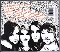
Riot is a band playing light rock music. The colour scheme of their digipack is black, white and orange, those three contrasting colours and matching together well and representing the style of the band. The orange colour is used to highlight important information included into the digipack. The front cover is showing the picture of the four members of the band. It is also repeating the roughly hand written logo to make people remember and connect with the artist straight away after seeing the cover. Also the white frame is containing the information about this album, however the name of it is not written with capital letter; this might be insignificant because Riot band is not caring about the formality of the writing; they know that they fans will listen to them no matter what. The background throughout the digipack is written with felt tip pen. The repetition of the bands name come across in every section and by looking at it you are getting the felling of graffiti type of style, although it is not.


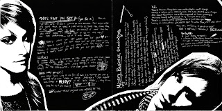
The inside page 1 is illustrating two members of the band on the black background. Their pictures are edited so that they are black and white to match to overall theme of the album. On page 1 there are private messages incorporated with photos, those messages are hand written, scratched on top of black background.  Page 2 is all about the credits and thanks to persons who helped with realisation of the Riot band album and digipack. Though they are mixed together creating the mix mash of words. On the back cover there is a close up picture on a members of band smiling, looking straight onto you. This is giving away the sense of being grateful and friendly toward everyone who listen to their music.  At the back cover there is also the list of songs included in album, however they are not numbered, but again mixed with various words you can only spot them because of different colour (orange; used to highlight).

Practice CD Cover Design


This CD cover idea came from my drawing of interpretation of Nerina Pallot song called Shopia. My orginal drawing had some different features, but I decided to change them as they didn't look nice while I was designing. So what has changed? Firstly in my drawing insted of artist head I drew the heart, however it wasn't looking proffesional enough. 
Therefore I decided to add a little bit surrealism to my design and insted of heart I placed artist head creating the character of a flower with human head. Also At my drawing I had houses and cars at the background, but I though it will be too much if I would add them to my design. What I like the most in my design is the paper cut effect of the 'flower body'. It makes the CD cover more interesting. If I would have chance to improve I would consider to change the font of the artist name as I think I could match better with the graphics.

Friday, 4 March 2011

Evaluation of My Final Magazine Cover

After turning my week points into as I believe my strong sections, I asked people one more time about their estimation of my magazine cover. The opinions were a lot better than last time, the bad comments also appeared but very rarely, however they concerned little things like a position of a barcode.

What people liked about my beauty cover now? They liked the match of main image and layout as well as the fonts used; they described it to be reflective in a sense of a genre of the magazine, eye catching due to various vibrant colours, friendly and interesting looking, nice, professionally made magazine cover. So I was really happy to hear those positive views of people. This time my magazine improved a lot. It is aiming at its target audience, looking fabulous and effective. I think the changing of the background from white to the whole image was a big step forward to what I achieved at the end. Now I suppose my magazine is looking better and if I would have a chance to improve it I would change the logo of the brand and I would also add a sky line at the top to make it look even more funky and professional. Overall I am satisfied with my work, I putted a lot of effort into it and I believe the effects are visible...

My Final Cover Design

Evaluation of My Pratice Magazine Cover

Review of my first magazine cover design wasn’t impressive; however people made some good and bad comments about it. Therefore to get the most of their opinions I tried to consider every point their made regarding my design.  Half of the peoples liked my white background and the main image of the model I chosen; they thought I was looking professional. The other half preferred to have whole image on the cover as they consider it appearing to be livelier. Vast majority liked my logo design and name, they review it to be successful in sending the message, not like the whole overlook of the magazine cover ,which they believed wasn’t  showing enough of my selected topic; beauty. What often people didn’t like was the layout and colour scheme. As I used three colour schemes; white, candy pink and light blue, the colours didn’t stand out very well, they did made the cover aiming for girls however it wasn’t bold and attractive enough. Whereas the layout of text was a bit confusing for eyes and the font styles didn’t match each other. In general my scores were good; however few pieces and areas needed necessary to improve.

Friday, 28 January 2011

Tuesday, 25 January 2011

LO1: Products Research, BIO or Normal? Price Comparison...

Organic food is healthier however be careful WHAT YOU BUYING , IT IS NOT ONLY THE NAMES OF ‘ECOLOGICAL’ PRODUCTS BUT IT SUBSTANCES. The price is also depending on whatever this is an organic or normal product. So to sell the product more effectively marketers know that you think that organic food is healthier, sometimes they might use it against you trying to convince you to by ‘eco’ product which is not really ecological. Therefore, on the packaging we now see more terms like: bio, eco, organic. Do not be fooled; the products must be certified as organic produce to ensure the special conditions and the resulting special properties.

Thus when shopping you need to be vigilant, because the creativity of producers who want to convince you that their food is prepared in a natural way, properly knows no bounds. Eco, bio, organic, traditional, country, straight from the peasant, from the cleanest British regions; such a determination can be seen on the packaging of many products. You have to remember that this is just a name. Sometimes, they are used, even if there is no content in common with ecology and contains lots of artificial additives and chemical residues.

From a legal point of view, the use of non organic product label, without a certificate, terms like organic, or eco, even if they are part of proper names, is seen as an attempt to sell the product as a conventional organic. So when shopping is better to check the product values rather than get suggestions from the packaging. Next time you shop be prepared to see a real ‘lies’ on a shelves.

Sunday, 16 January 2011

LO1: The Brand Globalisation Essay

By creating a brand name and image of the manufacturer should consider the area in which the brand wants to use and sell their products. In the past, it happened so often that companies that have attempted to use existing local brand when introducing the product into new foreign markets did not affect success.

Mark did not fulfill its task if it was difficult to pronounce and remember, if it sounds ridiculous or was offensive as well as did not induce the desired associations. It could also happen that the brand has already been applied in a given market by another manufacturer. In this situation, companies have been forced to create a new brand for the same product, which was used when selling abroad.

Some companies sell their product in several countries, accompanied by several brands. And there are big investments which corporation spend on promotion, advertising and packaging. In addition, packaging becomes less transparent and less fully informative function.

However, we can observe the phenomenon of a shrinking of global market. The intensity of this trend, we can easily see the example of Europe; very quickly disappear duties and other barriers to trade is thus much more efficient and effective. Companies that designate as an area of the territory of European states seeking to create a so-called. Euro brands, a mark whose name will be responsible for the product regardless of the country in which it will be sold.

For example, a Mars in order to facilitate the gaining of new markets have replaced their brands Bonitas Treets to the world-famous M & M and its third largest brand in the markets Marathon has replaced Europe and the U.S. Snickers brand. Procter & Gamble introduced the European countries, a common brand Ariel, which was crowned with success.

On the other hand there are brands that have gained global acceptance. In the case of such companies as Coca-Cola, Sony and McDonald's which not have to create new brands for different businesses, since the names of these brands are well recognized throughout the global market. It is noted that thanks to a far better possibilities of easy and quick exchange of information and the ability to easily travel the global society is becoming more homogeneous in preferences and better respond to global brands.

The use of global brand has many advantages. Benefits due to the possibility of using standard packaging, labeling, promotion and advertising. The company achieved this way in the above savings areas and an increase in sales because travelers perceive familiar brands offered in other countries. A global brand is gaining more recognition, especially if the country of its origin is widely appreciated. An example is the use of global brands by Japanese companies in the technology industry because their products in this area have a high reputation; customers quickly accept them and have confidence in their quality.

The use of global marketing yet may be combined with high costs and a high degree of risk. Significant costs borne by the company that decides to replace the existing global brand names used on the local market. This involves informing their customers that they may still purchase a product known to the re-branded. Local managers often express dissatisfaction if the command is to re-branding, because it causes the abandonment of local creativity, which could have an impact on strengthening the position of the local market. The risk of global brands associated with the fact that the overall global brand may not be as powerful as a convincing and encouraging the various brands used in local markets. There are also criticisms that the globalization of marketing ignores differences not only between countries but also regions.

Overall, the companies that sensible policy of global brand marketing means only those products where they can bring big savings, and the local terminology used in relation to those elements of its offerings that require such solutions to be able to successfully establish on the market

What impact does brand globalisation have on us?

An important property of the brand is to create consumer confidence in the product and the company that the brand is used. The condition for the creation of this trust can be symbolic (psychological), satisfaction or respected by the brand name product quality assurance function.

The brand is a promise that your product will always represent a specific set of physical features and benefits for the consumer and guarantee product quality. The quality perceived by the client includes the impression of overall quality or superiority of the offer in relation to the effect intended by the purchaser effect compared with alternative offerings. When you buy a particular brand product, the consumer knows what the quality of the product, the sensory qualities, and finally, what level of prices is represented by the brand.

The importance of global brands for the consumer is the fact that the consumer purchases "something" over the goods and benefits. First, he buys a vision, the emotional aspects of the product to the decision to purchase a much greater impact than rational factors.

Mark can also reduce risk for the buyer: Financial (associated with a specific amount of money), the action of the product (in the case of buying an unknown brand), physical (injury to the consumer), social (lack of acceptance), psychological (the mismatch between brand image and the image of her user) and the risk of loss of time.

Globally branded product also gives consumers a sense of security, guarantees quality and reliability. Consumers who value their time will pay a higher price for the certainty that they will not have any problems with the product. Having a branded product gives satisfaction because of the prestige and enhancement of belonging to a particular group.

Benefits offered by the brand include:
• Functional elements, called substantive, concern such as dimensions, weight, wear resistance, performance, reliability, and refer to the functional quality.
• Virtual components - assets, generated in the minds of individuals, because of "the illusory nature brand" consumers purchase no real benefits, but psychological satisfaction.

Consumer choice is not only to express preference for global brand, but also preferences for the size and type of packaging, product formulation, formulation and taste. Therefore the choice of brand is rarely the ultimate choice.

Every purchase is an expression of the brand personality of the purchaser's worldview, way of life, attitudes and desires. The consumer selects the products and brands that suit his/her culture and style and contribute to the construction of such an image of what he/she wanted.

Friday, 14 January 2011

LO1: Logo Research

LO1: Semiotics & Polysemic

Semiotics is a science of signs.

Ex. Rose
Denotation – Plant/flower
Connotation – Implied meaning or associated meaning
All of these will contribute to the understanding of the person. (Life style, social class, experience, social background, religion, area they live in, age, gender, sexuality)


Polysemic, can have many meaning.
Dog also means to ‘follow tenaciously’, ‘a worthless person’ ect...
Words for dog = bitch, canine, man’s best friend, cur ect...


LO1: My Mood Board


Moodboard is usually a series of images stitched together in a collage that serves as the designer or designers to show the visual format of project concept. In principle, a moodboard need for exposure to the client and must contain itself as much data as possible on the project to express the idea.

I used the mood board to present my favourites print-based media like magazines, CD covers etc...

LO1: The Timeline


Woodblock printing 220 CE
Contain printing text, patterns and images. It was invented in China as a method of printing on textiles and later on paper.

1040
Movable type is the system of printing and typography using movable pieces of metal type, made by casting from matrices struck by letter punches.

The rotary printing press was originated in 1843 by
Richard March Hoe. It uses impressions curved around a cylinder to print on long continuous rolls of paper or other substrates. Rotary drum printing was later significantly improved by William Bullock.

Offset printing is a widely used printing technique where the inked image is transferred (or "offset") from a plate to a rubber blanket, then to the printing surface.

Gravure printing is an intaglio printing technique, where the image to be printed is made up of small depressions in the surface of the printing plate. Gravure printing is used for long, high-quality print runs such as magazines, mail-order catalogues, packaging, and printing onto fabric and wallpaper. It is also used for printing postage stamps and decorative plastic laminates, such as kitchen worktops.

Professional digital printing (using toner) primarily uses an electrical charge to transfer toner or liquid ink to the substrate it is printed on. Digital print quality has steadily improved from early colour and black & white copiers to sophisticated colour digital presses.