Mika is an very positive artist, therefore his design for album is funky and cartoony style as even the title of his CD is ‘Life in Cartoon’. The main focus on the front cover is the artist’s name created in a 3D technique, the actual photograph of a singer is blended into the cartoony drawings; it is really small, but placed next to his name so people will straight away recognize him from the imaginary world. The theme beyond all of the cartoons are the clouds and the sky. The style of music the artist is producing is easy to identify as there is a character laying on a sofa, audience will connect it with a relax and calm. Also the piano at the top, left corner is suggesting that the music will contain a lot of piano playing. The font used at the back is similar to the hand written effect, which makes CD more personal, according to the artist. Technique used throughout the design of the CD could be compared to the famous collage technique without using the ripping paper effect; replaced by computerized editing. Overall the CD have a positive effect on the audience as it is colourful, it reminds people of happiness and joy. I think artist achieved the wanted outcome and I personally like it as well.
FAERIE ARCHIVES DIGIPACK
The digipack of Faerie Archives is different from normal designs. Its design is printed on the old paper. To keep it really thematic there is the motif of old map of a house and letters and well as old pictures placed inside to keep audience more engaged and connected with the CD; it is like a sharing the secrets. Even the name of the band is bringing to mind that Archives is something old from the past.
The CD itself have a title kept with the same design as a inside of digipack, however the graphics and background colours are not the same. The blue and green theme is creating sense of sky. The character is representing the faerie with white wings and white clothing suggesting her purity. The faerie’s gesture might suggest the type of music included on the CD, gracious and delicate. On the other hand the old theme and maps might suggest the mystery and secrets therefore the music can reflect those subjects. Overall the digipack is really personal it reveals some secretes you are able to assume it by the notes placed inside and the map showing house and secret places.
RIOT DIGIPACK
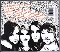
Riot is a band playing light rock music. The colour scheme of their digipack is black, white and orange, those three contrasting colours and matching together well and representing the style of the band. The orange colour is used to highlight important information included into the digipack. The front cover is showing the picture of the four members of the band. It is also repeating the roughly hand written logo to make people remember and connect with the artist straight away after seeing the cover. Also the white frame is containing the information about this album, however the name of it is not written with capital letter; this might be insignificant because Riot band is not caring about the formality of the writing; they know that they fans will listen to them no matter what. The background throughout the digipack is written with felt tip pen. The repetition of the bands name come across in every section and by looking at it you are getting the felling of graffiti type of style, although it is not.
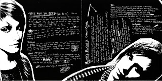
The inside page 1 is illustrating two members of the band on the black background. Their pictures are edited so that they are black and white to match to overall theme of the album. On page 1 there are private messages incorporated with photos, those messages are hand written, scratched on top of black background. Page 2 is all about the credits and thanks to persons who helped with realisation of the Riot band album and digipack. Though they are mixed together creating the mix mash of words. On the back cover there is a close up picture on a members of band smiling, looking straight onto you. This is giving away the sense of being grateful and friendly toward everyone who listen to their music. At the back cover there is also the list of songs included in album, however they are not numbered, but again mixed with various words you can only spot them because of different colour (orange; used to highlight).


No comments:
Post a Comment